Museum of Contemporary Art San Diego
Reassessing navigation structure and information scent to guide users through key flows

- Product designer
- UX researcher
- Visual designer
- Figma
- FigJam
- Zoom
- User research
- Usability testing
- Information architecture
This redesign was completed as an exercise for a course.
I was tasked with a redesign of MCASD’s website in order to better serve users, with a focus on accessibility and ease. Inspired by the museum’s mission and guided by user research, I honed my attention on helping users book tickets and evaluate the museum's current offerings.
Who does the art museum serve?
"The Museum of Contemporary Art San Diego invites all audiences to experience our world, our region, and ourselves through the prism of contemporary art."
With an inclusive mission, MCASD aims to serve all audiences. In our research, design, and testing, we should consider all people the museum serves, across all segments of the population. Certain considerations include age, ability, language level, education, and familiarity with jargon.
Art museums on the web today
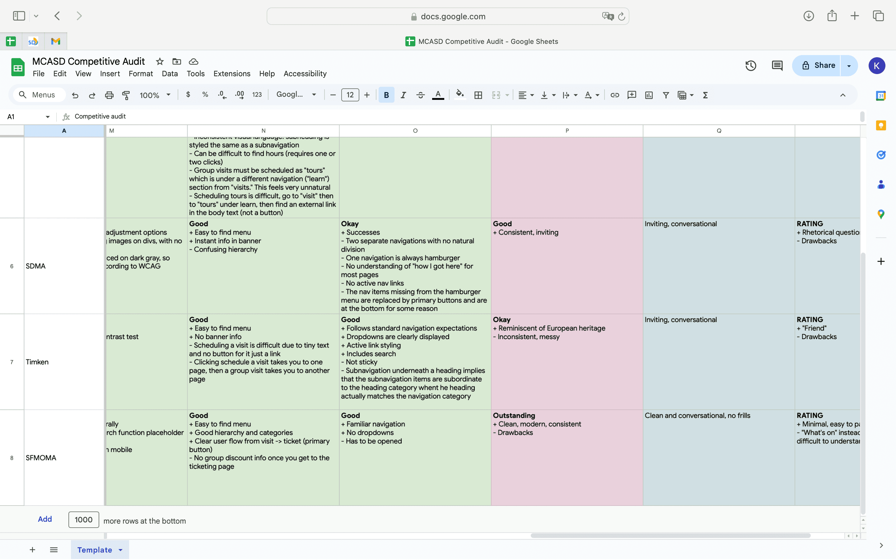
I conducted an extensive competitive audit of art museum websites across the United States, including other museums local to San Diego (San Diego Museum of Art, Timken Museum) and other museums with a focus on modern and/or contemporary art (MoMA, SFMOMA). Through this audit, I was able to take note of common patterns that I could leverage, as well as see how the current MCASD website addressed problems uniquely.
Unearthing existing pain points
Using the existing design, I conducted a usability test. The five users ranged from ages 20 - 65, and included multiple genders, and nonnative English speakers. I entered this round of testing with an open mind, attempting to peek at what kinds of usability issues were causing user drop-off and frustration. The tests focused on three key tasks that aligned with user needs for museum websites:
- Purchase tickets
- Book a tour
- Find out what art is on view
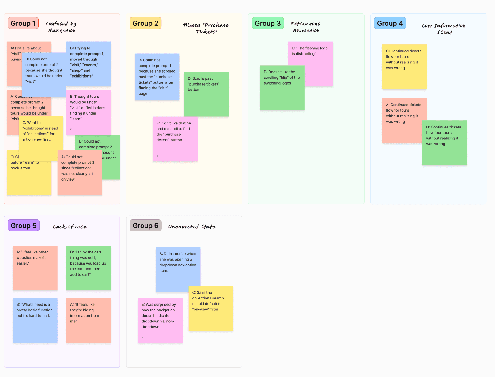
After writing observations and quotes on sticky notes, I created an affinity map to help cluster and develop theme from usability testing. Overwhelmingly, users felt that their ability to complete tasks like purchasing tickets, finding out what's on view at the museum, or booking a tour was slowed or blocked by a confusing navigation structure. Issues of weak information scent and unclear system state exacerbated these issues.
Establishing a more natural navigation
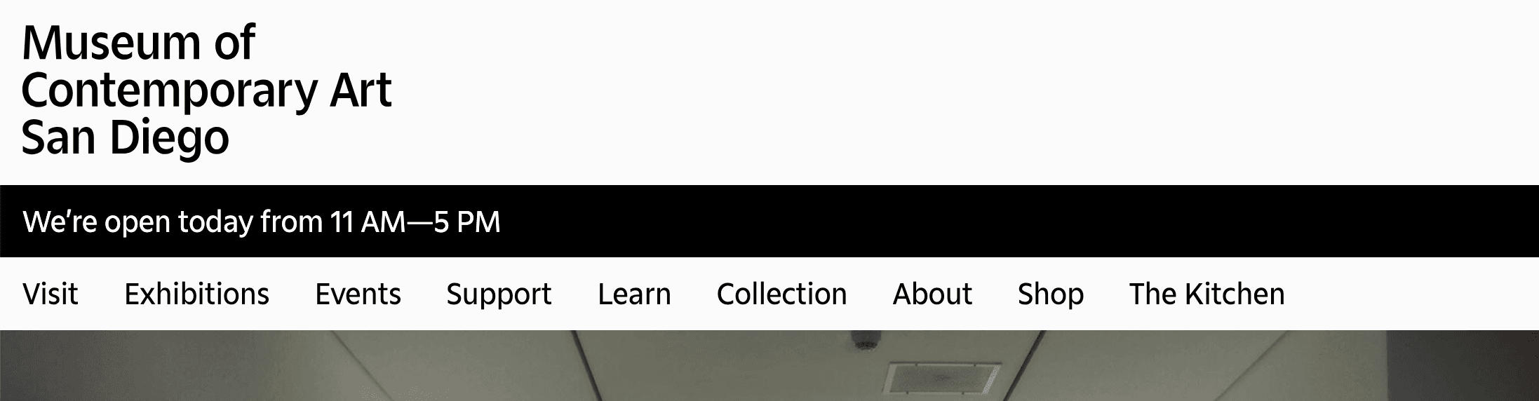
Indeed, 5 out of 5 of our users interviewed initially looked towards “visit” in order to book a tour, and 3 out of 5 dropped off the task because of this discrepancy between their mental models and the initial system model. The initial design categorized "tour" under "learn." Not a single user found this to be intuitive, and the site's usability suffered for it.
“What I need is a pretty basic function, but it’s pretty hard to find.”
Other similar issues were discovered in usability testing. In trying to find art on view at the museum, 3 out of 5 users struggled to pick between "exhibitions" and "collection," and 2 of these users picked "exhibitions" first.
Every user displayed scanning and comparing behavior when upper-level navigation items didn't provide a strong enough information scent for them to make confident decisions. That is, instead of seeing something that aligned with their mental models, they had to compare and contrast many potential choices, even ones that should otherwise seem patently wrong.
"What the heck is support?"
This discovery provided direction to our prototyping; in lieu of the resources necessary for a quantitative tree test, and drastic changes to the information architecture, we had to correct the higher-level navigation issues that slowed our users. In making design decisions about navigation, I wanted to align the design with user's existing mental models, as well as strengthen information scent such that users can make easy decisions.
In a world with unlimited time and money, this would mean several rounds of tree testing. But just our first round of usability testing gave us actionable insights as to how we could make conservative changes that would still drastically improve the experience of users.
To help users begin their ticket journey sooner, create a unique "Tickets" navigation item in the top-right of the header.
This is a common design pattern that addresses multiple issues at the same time.
- Users will no longer have to consider which top-level navigation item is parent to the ticketing process
- Users will no longer miss the "Purchase Tickets" button hidden away in the "Visit" page
- Users may be familiar with this design pattern of placing the tickets button in the top-right, common to a large amount of popular museum websites including MoMA, SFMOMA, and The Met.
To align with users' expectations, move the "Tours" page from "Learn" to "Visit."
Although people do learn on tours, visitors primarily think of tours as a guided visit rather than an educational tool.
To use language familiar to users, rename "Collection" to "Art and Artists."
During my competitive analysis, I noticed that many museums chose the latter option. During usability testing, I realized that "Collection" had little information scent to users - especially those unfamiliar with jargon. Not only is "Art and Artists" direct, but it also aligns with user expectations, following the principle of least astonishment.
To prevent misleading users, change "Support" to "Join & Give."
"Support" is deeply ambiguous. The original design suggested that the museum would provide help in this section, only for users to find that this was the section where the museum solicited funds from visitors. Not only is this dissonance surprising, it's surprising in a direction that can create negative sentiment.
Providing context for information foraging
It's a bad thing when users get lost. But it's even worse when we don't communicate with them that they're lost.
In usability testing, I found that 3 out of 5 users continued on the incorrect path when attempting to book a guided tour, using the ticketing user flow. This means that they were not getting the right kind of feedback. They felt that their choices were optimal, and nothing about the site indicated otherwise until they neared the end of the ticketing process.
We always hope that our information architecture and sitemap can be clear enough to guide users to make the right decision. But the reality is that each user is an individual, and there is no one sitemap that will align perfectly with each user's mental models. There is however, opportunities to provide information scent at every step of a user flow, on each page, not just at the upper navigation level.
To ensure users know where they are and where they can go, reduce chrome and show above-the-fold content.
One feature of the original that weakened information scent was the lack of above-the fold content. Large chrome (overhead interface), large headings, and large hero images on pages meant that users weren't sure that they could scroll or what content they would find on any given page. To ameliorate this, I decided to reduce the height of the hero images and headings such that on initial page load, users can see above-the-fold content.
To help users with mistakes, provide escape routes.
Other museum sites like MoMA will automatically guide users to book a tour if they buy too many tickets. Adding this feature to the website means that users who try to book tours through ticketing won't end up at a dead end.
To strengthen information scent, choose your words wisely.
Words aren't just words. They are signs and symbols. We want to make sure that the words we pick, whether in CTAs, navigation, or headings, do the work of guiding and informing users, not misleading them.
Creating visual clarity in navigation
One of our users failed to complete a task simply because she thought that clicking a navigation item would take her to a new page. It did not. "It's not working," she said, as she opened and closed the "Collection" subnavigation repeatedly. This made sense - she had already tried to purchase tickets earlier, and had clicked on the "Visit" navigation item, which took her to a new page. "Visit" and "Collection" are visually siblings, and users expect them to act accordingly.
The initial navigation design I worked with had three different types of navigation items that all looked identical, with no way for the user to accurately predict their behavior. Of the 9 navigation items, 2 were internal links, 5 were dropdown menus, and 2 were external links.
Whatever information architecture we settle on, we need to make sure our interface clearly communicates to the user what they can expect, otherwise they cease to complete important user flows. The behavior of the initial design was not just obscured, it was impossible to predict.
I made several decisions to ensure that the behavior of the navigation would be understood.
To create external and internal consistency, remove top-level landing pages for navigation items.
The previous behavior of the design meant that clicking a navigation item would sometimes expose categories, and other times direct a user to a landing page. By separating these landing pages into separate pages or consolidating them as subcategories of other top-level navigation items, we are able to establish predictable and consistent behavior that helps the user understand the system model.
Clarifying system state
2 out of 5 of our users had trouble comprehending the state of the navigation. In the more severe case, a user did not even realize when she was opening a lower-level navigation menu. This was an issue where preconceived ideas about brand identity clashed with usability and accessibility.
The initial design of the navigation menu consists of the following elements.
- Black active navigation item
- Black open navigation item
- Black open navigation dropdown menu
- Open navigation dropdown menu spanning the entire screen
- No borders
This created a situation where an open navigation dropdown menu could look like it "belonged" to the active navigation link instead of the open navigation category. Without memory of exactly what they had just done, users would have no way to understand the state of the navigation.
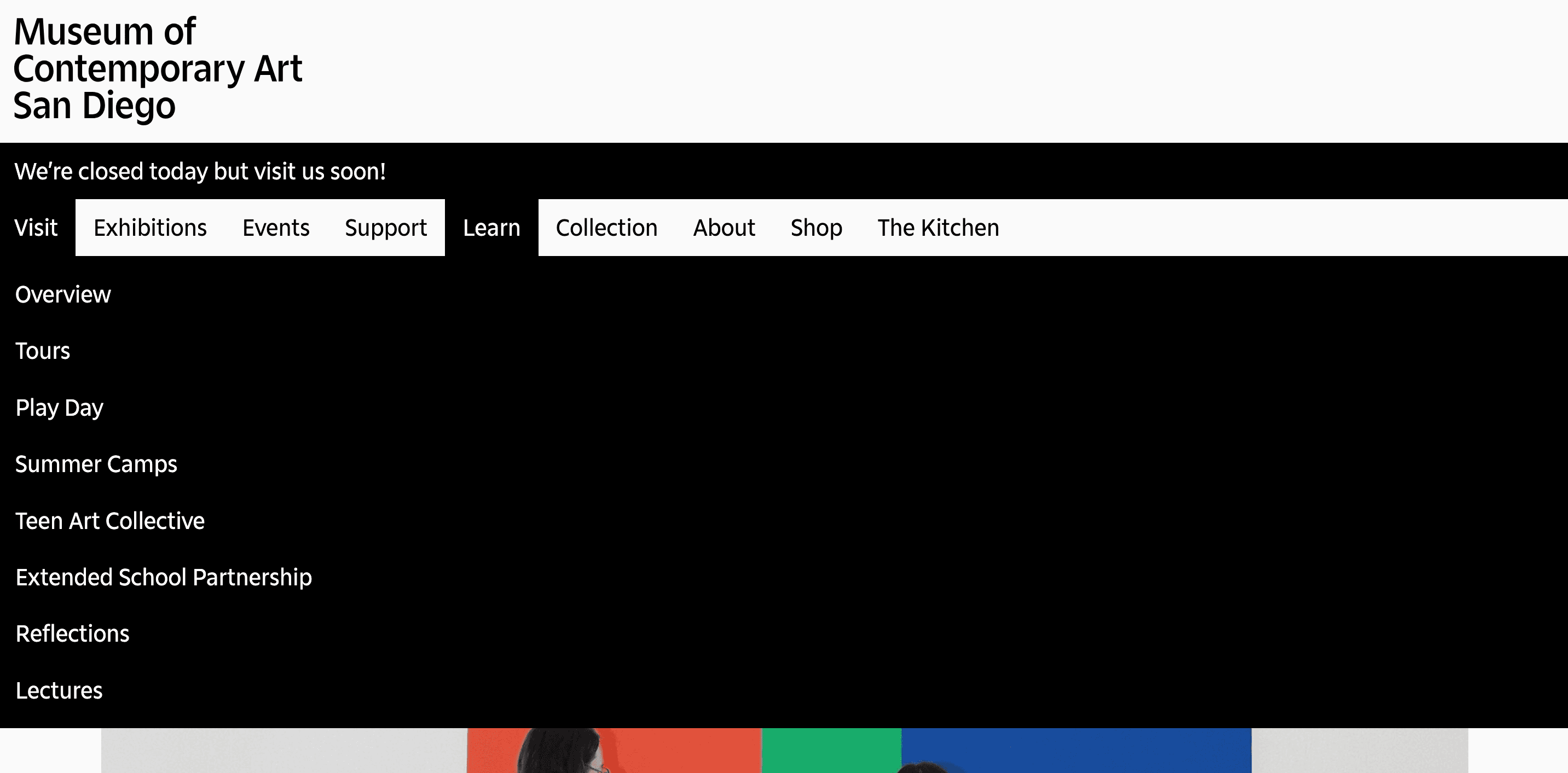
The screen-spanning dropdown navigation also blocks content from the user. In the most extreme case, opening the "Learn" navigation item of the initial design made it such that the navigation menu would block 85% of the entire screen.
As evidenced by the initial design, a color-minimal and borderless design language can introduce ambiguities or misrepresentations to the user. Keeping this design language and user needs in mind, I applied the following interface changes to ensure that changes in system state are communicated to the user.
Establishing a clear parent-child relationship for navigation categories
I narrowed the subnavigation dropdown menu, and relocated it such that the left side of the menu aligns with the left side of the parent. This creates a design where:
- Users understand that they have opened a dropdown menu.
- Users understand which parent item the dropdown menu belongs to.
- Minimizes the amount of content that the dropdown menu blocks, while also indicating clearly to the user when there is content being blocked
- Users do not need to look to the left to read dropdown items.
- Change the open menu color to light gray. The gray's proximity to the main alabaster indicates that the user is interacting with the item in an important way, while distinguishing it clearly from the black active navigation item.
Utilizing my knowledge of Gestalt principles, I made conservative changes that aligned with both user needs and brand identity. The design remains stark and borderless in line with the existing design language, but using only enough color to explicate changes in the system state that were previously hidden from users.
Bringing it together
Beginning with an audit of competitors and a usability test on the existing design, I discovered pain points that were preventing museum visitors from being able to complete key tasks. By recognizing where the system model was misaligned with the user's mental model, I was able to design changes that addressed these important usability issues. These changes included changes to the information architecture, visual design of the navigation, and both simply and importantly, a call-to-action in the top-right of the header to get users to their tickets as easily as possible.
The end result of this project was a website reassessed and redesigned with an emphasis on guiding users through the tasks that they were previously blocked from completing.
What I learned
This was my first time conducting usability testing for product design. I found that the process of testing is full of surprises that can inform our design decisions. No one user is the same, and ever user has their own mental model. As designers, it's our job to interact with users to get as acquainted as we can with these models so that we can align our product with them.
What's next? What could I have done differently?
I started this project with an assumption that the museum wants to sell tickets. While I this is maybe the safest assumption I can make, it doesn't consider that a museum's business model is contingent on more than just visitors. Other people to consider include people renting the venue (it's on the beach!), philanthropic donators, and corporate sponsors.
With regards to the user flows I focused on, there's still room for qualitative research strategies, specifically tree testing to further investigate the information architecture of the website.